Brand Portal – Davos Source
Introduction
Autopilot for your business
StrawBlond is the modern AI-powered software for accounting, QR invoices, time tracking, and projects. Made for 🇨🇭 Swiss SMEs.
Logo
Wordmark

Icon

Typography
Helvetica Neue LT Pro
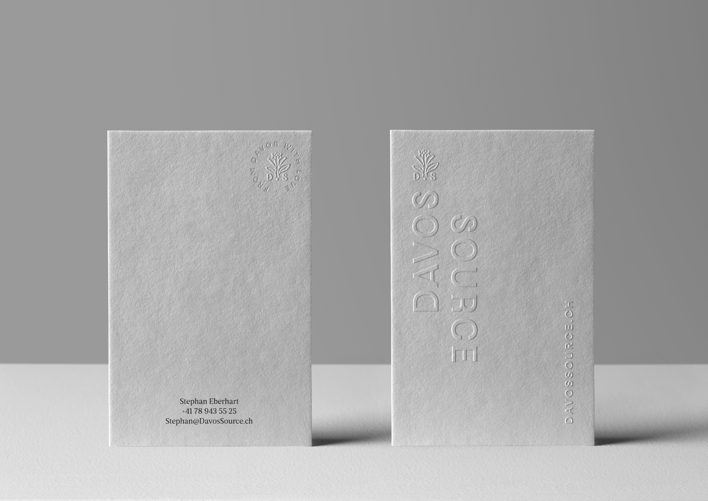
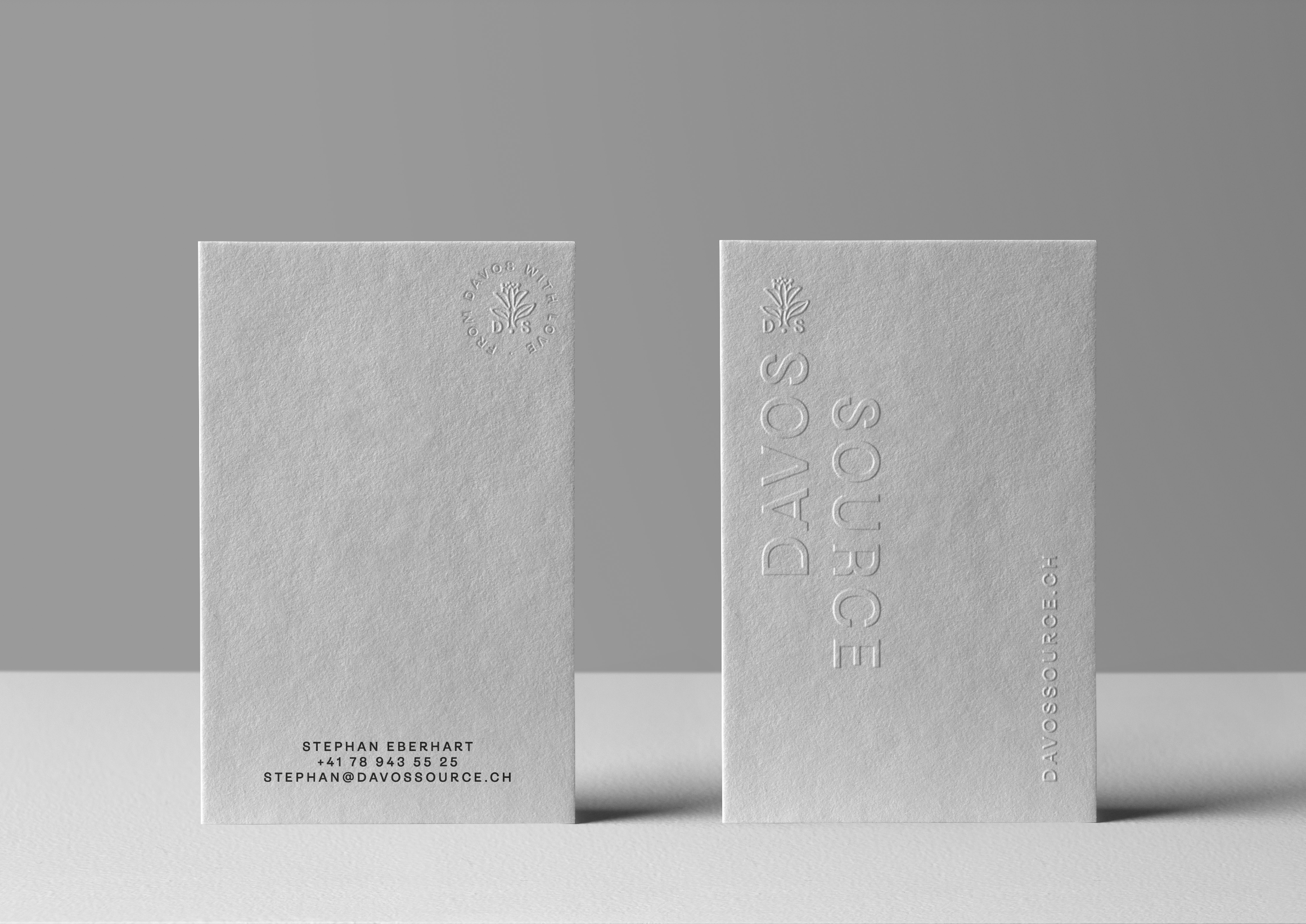
Davos Source uses Helvetica Neue LT Pro exclusively.
The typeface reflects clarity, neutrality and restraint. It supports the content without drawing attention to itself – no effects, no alternatives, no stylistic variations.
Typography is intentionally generous:
clear hierarchies
calm spacing
ample white space
White space is an active design element. It creates focus, readability and calm, allowing content to breathe rather than compete.
The consistent use of a single typeface ensures a reduced, timeless and unmistakable brand presence across all media.

Colors
Colour Palette
The colour system of Davos Source is deliberately minimal.
Only black and white are used.
White is not a background, but an attitude.
It stands for purity, clarity and focus. Space is created, design becomes calm, and the imagery is allowed to speak for itself.
Black provides contrast, structure and precision. It grounds the brand and gives content weight without visual noise.
There are no decorative colours and no visual effects. The palette remains clean, restrained and timeless.
This strict reduction ensures a brand presence that feels pure, confident and enduring – across all media.